In-App & Mobile Landing

In-App messages are messages displayed inside your app. You can trigger them when users open your app or as contextual reminders when they perform a specific action (e.g. tapping a button, browsing a page, etc). This is great to communicate with all your users, even with users who have turned off push notifications.

You can also trigger an In-App message after your users open a push notification. That's what we call a Mobile Landing.

The process for creating content for both Mobile Landing and In-App messages is similar. Unless specified otherwise, the information in this section applies to both features. Mobile Landing specificities are covered within the Push section.

SDK Version Requirements: Utilizing the Mobile Landing feature requires SDK version 3.0 or higher.

Messages can be targeted to either both iOS and Android platforms or filtered for a single specific platform.

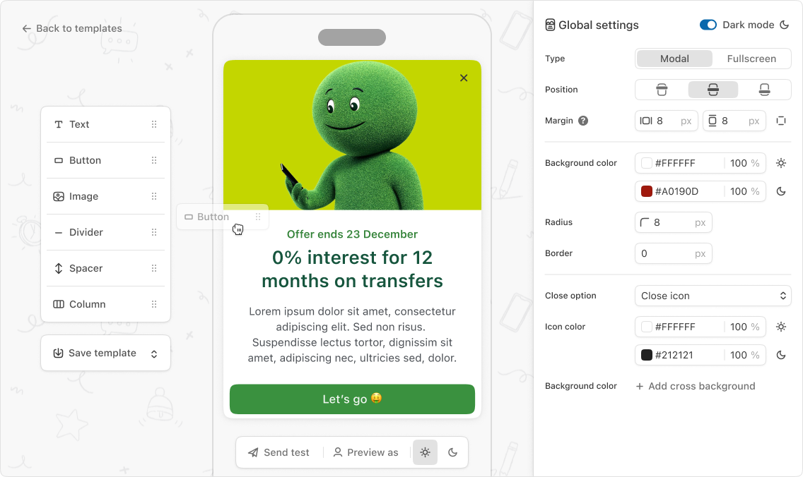
These messages are designed using a drag & drop composer.

Formats

Available In-App message formats include:

  • Modal: A pop-up displayed over a portion of the screen. Modals can be positioned at the center, top, or bottom of the screen.

    • Center Modals: These appear in the middle of the screen and include a translucent backdrop that prevents interaction with the app content behind them.

    • Top/Bottom Modals: They were previously referred to as "banners" in the MEP. They are displayed at the top or bottom edge of the screen and do not have a backdrop, allowing users to continue interacting with the app content behind them. These modals can be "attached" directly to the screen edge by setting their margins to zero.

    The vertical size of all modals automatically adjusts to fit their content.

  • Fullscreen: A message that occupies the entire screen, overlaying the app content.

Modal
Banner
Fullscreen

Various visual customization options are available for these formats:

Customization
Description
Value Type
Applies to Format(s)

Modal Position

Controls the vertical alignment of the modal pop-up on the screen.

top, middle, bottom

Modal only

Fullscreen Content Position

Determines the vertical alignment of the message content block within the fullscreen container if the content does not fill the entire screen.

top, middle, bottom

Fullscreen only

Background Color

Sets the background color of the message container, including opacity.

Color

Modal, Fullscreen

Margin

Defines the spacing between the edges of the device screen and the In-App message content. Can be configured independently for top, bottom, left, and right sides.

Pixels

Modal only

Radius

Controls the roundness of the corners for the message container.

Pixels

Modal only

Border

Sets the thickness of the border around the message container. (Optional)

Pixels

Modal only

Border Color

Sets the color of the border around the message container, including opacity. (Optional)

Color

Modal only

Close Options

To allow users to dismiss the In-App message, several close options are available. Unless a button action within your message is specifically configured to dismiss the In-App, you must enable at least one of these options:

  • Close Icon: Displays a ‘X’ dismissible icon in the top right corner of the message. You can customize the color and background color of this icon separately.

  • Auto-Dismiss: The message automatically disappears after a specified duration. A visual gauge is displayed to show the remaining time. The auto-dismiss duration is customizable (in seconds).

  • Platform-specific dismissal methods (like swipe gestures on iOS or the back button on Android) are always possible.

Color Picking

When configuring color options within the composer, click the color swatch (the colored square) next to a setting to open the color picker interface. This tool allows you to visually select a color, refine it using a spectrum slider, and quickly choose from a list of recently used colors. The chosen color's code (e.g., in Hex format) is displayed and can also be directly entered or copied and pasted.

Blocks description

Using our drag & drop composer, your In-App messages are composed of various blocks.

Text

The Text block allows you to include textual content within your message. It supports personalization to dynamically insert profile or trigger event specific information. See Personalizationfor more details.

The following visual customization options are available for the Text block:

Customization
Description
Value type

Margin

Configures the spacing around the text block, independently for top, bottom, left, and right sides.

Pixels

Text alignment

Controls the horizontal alignment of the text within the block.

left/center/right

Color

Sets the color of the text.

Color

Font size

Sets the size of the text using predefined scale options.

XS/S/M/L/XL

Font decoration

Applies visual styles to the text. Multiple decorations (Bold, Italic, Underline, Strikethrough) can be selected simultaneously.

bold/italic/underline/strikethrough

Button

The Button block allows you to include interactive buttons in your message layout.

Each button should contain text. The customization options for this text (e.g., font size, color, decoration) are inherited from the Text block and applied directly to the button's label.

Buttons must also have an action associated with them, defining what happens when the user interacts with the button. By default the Dismiss action is selected.

Available Built-in Actions

Configurable built-in actions that buttons can trigger include:

  • Dismiss Closes the In-App message.

  • Deeplink Closes the In-App message and opens the specified deeplink or web page.

  • Copy to clipboard Copies the provided text to the device's clipboard. The In-App message will be dismissed. Optionally, a deeplink or web page can also be specified to open after copying.

  • Smart Push re-optin Displays the system push notification authorization prompt to eligible users. If the user has already been asked for push notifications opt-in, it opens the system notification settings instead. If the user is already opt-in, the message will disappear after clicking the button but no further action will be triggered.

  • Rating

    • iOS: Displays the app rating dialog. Note that the system limits this dialog to a maximum of three displays within a 365-day period. Your automation triggering this action should be rate-limited accordingly (e.g., maximum three times per year per user).

    • Android: Displays the Google In-App Review feature. Your automation triggering this action should also be rate-limited. The play-core library is required in your application to display the Google In-App review feature. See SDK integration.

  • Redirect to settings Opens the notification settings for the current application, where notification permissions can be managed.

In addition to these built-in options, you can also configure custom actions that are registered within your application. See corresponding documentation for Android and iOS.

The following visual customization options are available for the Button container itself:

Customization
Description
Value type

Margin

Configures the spacing around the button block, independently for top, bottom, left, and right sides.

Pixels

Padding

Configures the internal spacing between the button's text content and its border/edges.

Pixels

Width

Sets the width of the button relative to its container.

Percentage

Button alignment

Controls the horizontal alignment of the button block within its parent container.

left, center, right

Button color

Sets the background color of the button, including opacity.

Color

Radius

Controls the roundness of the button's corners.

Pixels

Border

Sets the thickness of the border around the button. (Optional)

Pixels

Border Color

Sets the color of the border around the button, including opacity. (Optional)

Color

Image

The Image block allows you to display images within your message layout.

Images can be provided by uploading an image file directly or by referencing an image URL. Supported image formats are PNG and JPEG. Uploaded image files must not exceed 4MB in size.

Images can optionally have an action associated with them, similar to buttons. Clicking the image will trigger this action. The available built-in actions are detailed in Available Built-in Actions.

The following visual customization options are available for the Image block:

Customization
Description
Value type

Margin

Configures the spacing around the image block, independently for top, bottom, left, and right sides.

Pixels

Height

Sets the height of the image block. Explained below.

either auto or with a custom number of pixel

Sizing

Controls how the image scales to fit within the block dimensions. Explained below.

fill or fit

Radius

Controls the roundness of the image block's corners.

Pixels

Height Setting

The Height of the image block can be set to auto or a custom pixel value. When set to auto, the height is automatically determined based on the image's intrinsic aspect ratio and the available width of the block's container, ensuring the image is displayed without distortion using its natural proportions. The custom option allows you to specify a fixed height in pixels.

Accessibility Description

You can provide an accessibility description (alt text) for an image. This description should only be filled in if the image conveys information essential for understanding the content of the In-App message. This text is used by screen readers and other assistive technologies.

Image Selection Guidelines

Choosing the right images is key for effective In-App messages on all devices. The wide variety of screens means a perfectly identical display everywhere is impossible. Follow these tips to optimize your images. File Specifications

  • Formats: Use standard web formats: PNG, JPG, and WebP.

  • Size: Ensure images are lightweight for quick display. In-App messages should not exceed 4MB.

  • Minimum Dimensions: Aim for a minimum width of 640px to ensure good resolution.

Display Modes (Sizing)

You can control the height of the Image block using the Height setting. The Sizing setting (Fill/Fit) then controls how your image adapts to this block size. This setting is only applicable when the Height is set to a custom pixel value (not auto).

  • Fill: The image scales proportionally to fill the entire block. This may crop parts of the image if aspects ratios don't match. We recommend a square file, with a width of 1200px.

  • Fit: The image scales proportionally to be entirely visible within the block. Nothing is cut off. This may leave empty space on the sides if aspect ratios don't match.

Fill display mode: left and right sides of the image are cropped
Fit display mode: image is fully visible, there are some empty spaces at the top and bottom of the image

Design Recommendations

  • Put key info in Text/Button Blocks: Don't put crucial messages only in the image. Text and buttons managed outside the image adapt better to various screens.

  • Image composition: Avoid placing text or important elements near image edges to prevent cropping in "Fill" mode. Center the most important element in your image.

  • Dimensions and aspect ratio: There's no single ideal size. Landscape format images (e.g., 2:1 or 3:1 ratios) work well for Fullscreen and Modal themes. Portrait formats suit designs where the image is the main focus.

Crucial Step: Test on Devices

The most important step is to test your message and images on real devices thanks to the Send test option. This verifies the final display on different screens before sending your campaign.

Divider

The Divider block allows you to insert a horizontal rule to visually separate content elements within your message layout.

The following visual customization options are available for the Divider block:

Customization
Description
Value type

Margin

Configures the spacing around the divider block, independently for top, bottom, left, and right sides.

Pixels

Width

Sets the width of the divider line relative to its container.

Percentage

Alignment

Controls the horizontal alignment of the divider line within its container.

left, center, right

Thickness

Sets the visual thickness of the divider line using predefined scale options.

XS/S/M/L/XL

Color

Sets the color of the divider line, including opacity.

Color

Columns

The Columns block acts as an invisible container that allows you to arrange other blocks horizontally in multiple columns, supporting up to 5 columns.

You can place any block inside a Columns block, with the exception of Divider blocks and other Columns blocks.

The following settings are available for configuring a Columns block:

Setting
Description
Value type

Number of columns

Sets the number of vertical divisions within the block.

2 to 5

Sizing

Defines how the available horizontal space is distributed among the columns. Can be set to auto (equal distribution) or custom percentages (a list of percentages for each column, which must total 100%).

auto / custom sizing (in percentages)

Spacing

Sets the horizontal space between individual columns.

Pixels

Padding

Configures the internal spacing between the content and the column edges.

Pixels

Content alignment

Controls the vertical alignment of blocks placed inside each column.

top, middle, bottom

Additional options

Dark mode

You can configure a dark mode version for each In-App template to match user device settings. With dark mode enabled, you can specify separate color values for light and dark themes. Each mode can be previewed directly within the In-App composer.

Note that when using the “Send test option”, the In-App message will render according to the test device's dark mode setting, not the mode selected in the composer preview.

Advanced settings

A Custom payload and a Tracking id can be defined at campaign level.

Custom Fonts

By default, Batch uses the system font set on the user's device.

To use a custom font for your brand, it requires implementation in your application's native code.

For bold or italic text styles to display correctly, the corresponding bold and italic font files must be provided and implemented alongside the regular font.

Refer to the documentation for Android and iOS for custom font platform-specific implementation details.

Preview and Device Testing

The In-App composer preview is a useful tool for designing your message, but final appearance and behavior can vary across devices and operating systems. Always test your In-App message on actual devices using the "Send test option" to ensure it looks and works as intended.

Templates

Templates are reusable blueprints for your In-App message layouts. Saving your In-App structure and styling as a template allows you to quickly create new messages with a consistent look and feel without starting over each time. Saving a message as a template is optional; In-App messages function independently of whether they were saved as templates.

Modifications made to a template do not affect existing In-App messages or live campaigns that were created using that template, and vice versa. You can update the structure and styling of an existing In-App message and choose to save these changes by overwriting the original template or by creating a new template.

As a starting point, a selection of pre-built Batch templates is available to showcase various In-App message possibilities. These specific templates are read-only and cannot be modified or overwritten.

A template defines the structure and styling of an In-App message. This includes:

  • The type and position of each block (e.g., Image block, Text block, Button block, Columns block, Divider block).

  • The visual customization settings applied to each block (e.g., margins, colors, sizes, corner radius).

Importantly, templates do not include the content or specific behavioral configurations. This means the following are not saved in a template:

  • The actual text written in a Text block.

  • The image file uploaded or the image URL used in an Image block.

  • The specific action configured for a Button or Image block, including the action type (e.g., Deeplink, Rating, Smart Re-Optin) and any associated parameters (e.g., the target URL for a Deeplink, the text for Copy to Clipboard).

Importantly, when multi-language support is enabled, the template structure and styling are common across all languages while the content is managed separately for each language.

Last updated

Was this helpful?